I clicked on this article while browsing through one of the previously posted websites, and thought it was really interesting. The site includes the history, strengths and appropriate uses of these typefaces. As someone who's relatively green at this, I find it really helpful.
Wednesday, February 29, 2012

Duane Reade
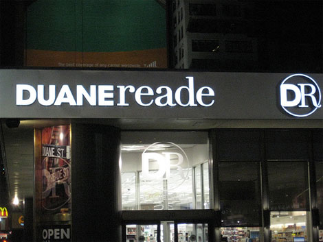
I noticed the renovation of Duane Reade's image. Both store fronts and logos are visible in Union Square. Which one do you prefer, the old (the first two images) or the new (the latter two images) Duane Reade?



Signs
In my Critical Reading and Writing 2 class we read "How to Read a Sign" in Why We Buy: The Science of Shopping by Paco Underhill (it begins on pg. 61). In the chapter, Underhill wrote, "When it comes to positioning a sign, the difference between an ideal viewing spot and a terrible one is often just a few feet" (64). I found this article to be fascinating since it describes the best ways to display a sign, from the location to the length of the message.
http://books.google.com/books?id=euHukAn4KuYC&pg=PA73&lpg=PA73&dq=how+to+read+a+sign+by+paco+underhill&source=bl&ots=UZsaJRhYtg&sig=z7aQBLOqzCYpY93tPLkQtrVFNB0&hl=en&sa=X&ei=KrxOT4jeD-S50QG9pNXqAg&ved=0CCAQ6AEwAA#v=onepage&q=how%20to%20read%20a%20sign%20by%20paco%20underhill&f=false
Additionally, in class we discussed signs such as the old way Burma Shave advertised by dividing up their message and displaying the short phrases in order:

http://books.google.com/books?id=euHukAn4KuYC&pg=PA73&lpg=PA73&dq=how+to+read+a+sign+by+paco+underhill&source=bl&ots=UZsaJRhYtg&sig=z7aQBLOqzCYpY93tPLkQtrVFNB0&hl=en&sa=X&ei=KrxOT4jeD-S50QG9pNXqAg&ved=0CCAQ6AEwAA#v=onepage&q=how%20to%20read%20a%20sign%20by%20paco%20underhill&f=false
Additionally, in class we discussed signs such as the old way Burma Shave advertised by dividing up their message and displaying the short phrases in order:

Tuesday, February 21, 2012
Helvetica Flim
Helvetica Flim shows Helvetica is used by almost graphic design field.
Here is link for Helvetica film website. http://www.helveticafilm.com
And this is Helvetica film trailer.
Here is link for Helvetica film website. http://www.helveticafilm.com
And this is Helvetica film trailer.
Friday, February 17, 2012
Typodarium 2012
For all typography lovers, check out the Typodarium 2012 from Slanted!
It comes with 366 fonts from 252 designers from all around the world.


For more information, visit here : http://fontfeed.com/archives/typodarium-your-daily-dose-of-type-in-2012/
To purchase one, visit here : http://www.slanted.de/shop/typodarium-2012
It comes with 366 fonts from 252 designers from all around the world.


For more information, visit here : http://fontfeed.com/archives/typodarium-your-daily-dose-of-type-in-2012/
To purchase one, visit here : http://www.slanted.de/shop/typodarium-2012
"SPENGLISH"

Absolut Vodka Funny Advertising


For this post I chose Absolut Vodka advertising, because there are so many funny and creative advertises. Not only created by the company but also by other people. They are very unique and interesting. Let me know what you think about it !
Subscribe to:
Posts (Atom)